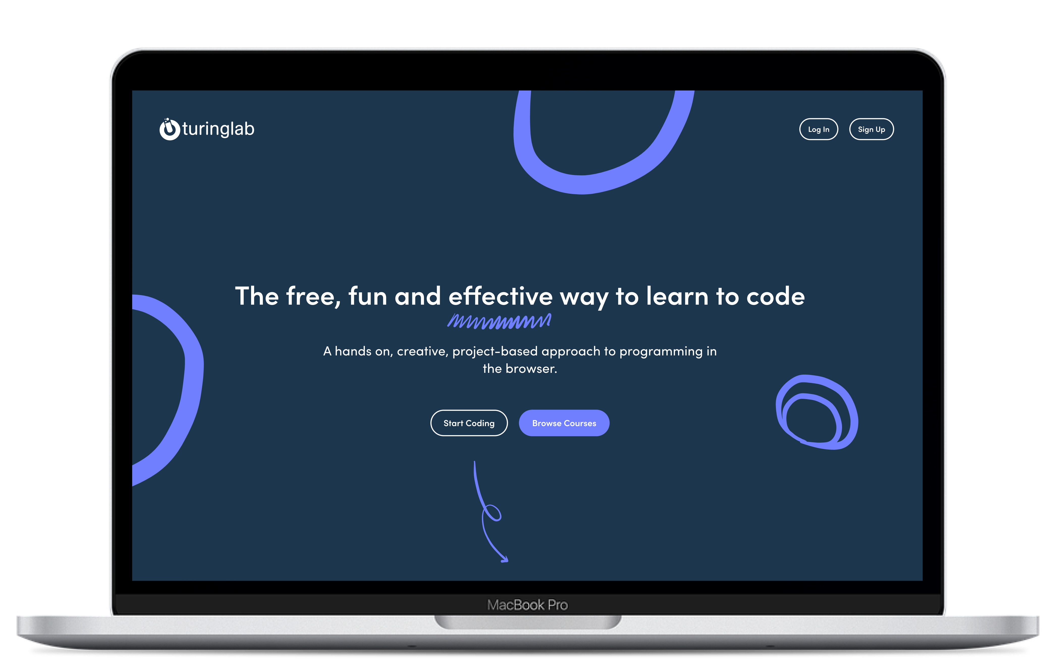
While working for Turinglab I got the chance to redesign their website. This is because the old website looked a bit old-school and needed some sprucing up.
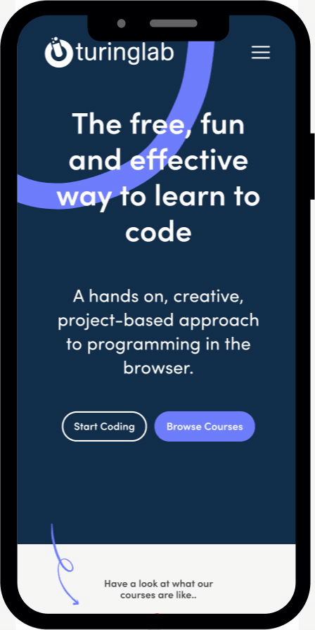
Using Mix Panel we realised a lot of Turinglab's customers accessed the platform on their mobile devices. This previously wasn't the case and the old website had bad mobile compatibility.
The redesign therefore had to be conscious of the different devices it was going to be viewed on.
The new website was also going to function differently from the old one. It needed to give users quick access to Turinglab's courses, challenges and projects.
This would hopefully increase the sign up flow to Turinglab's platform.
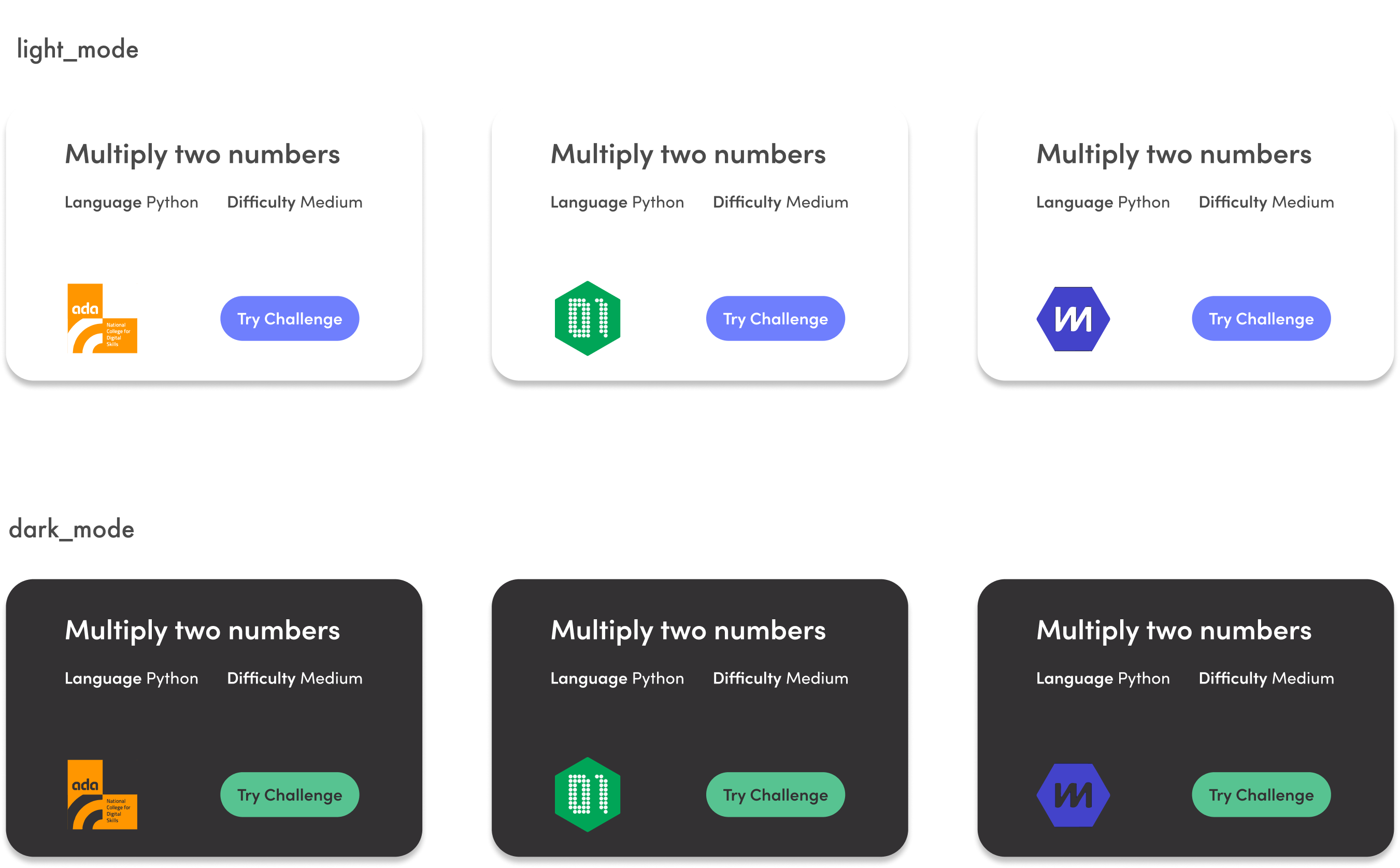
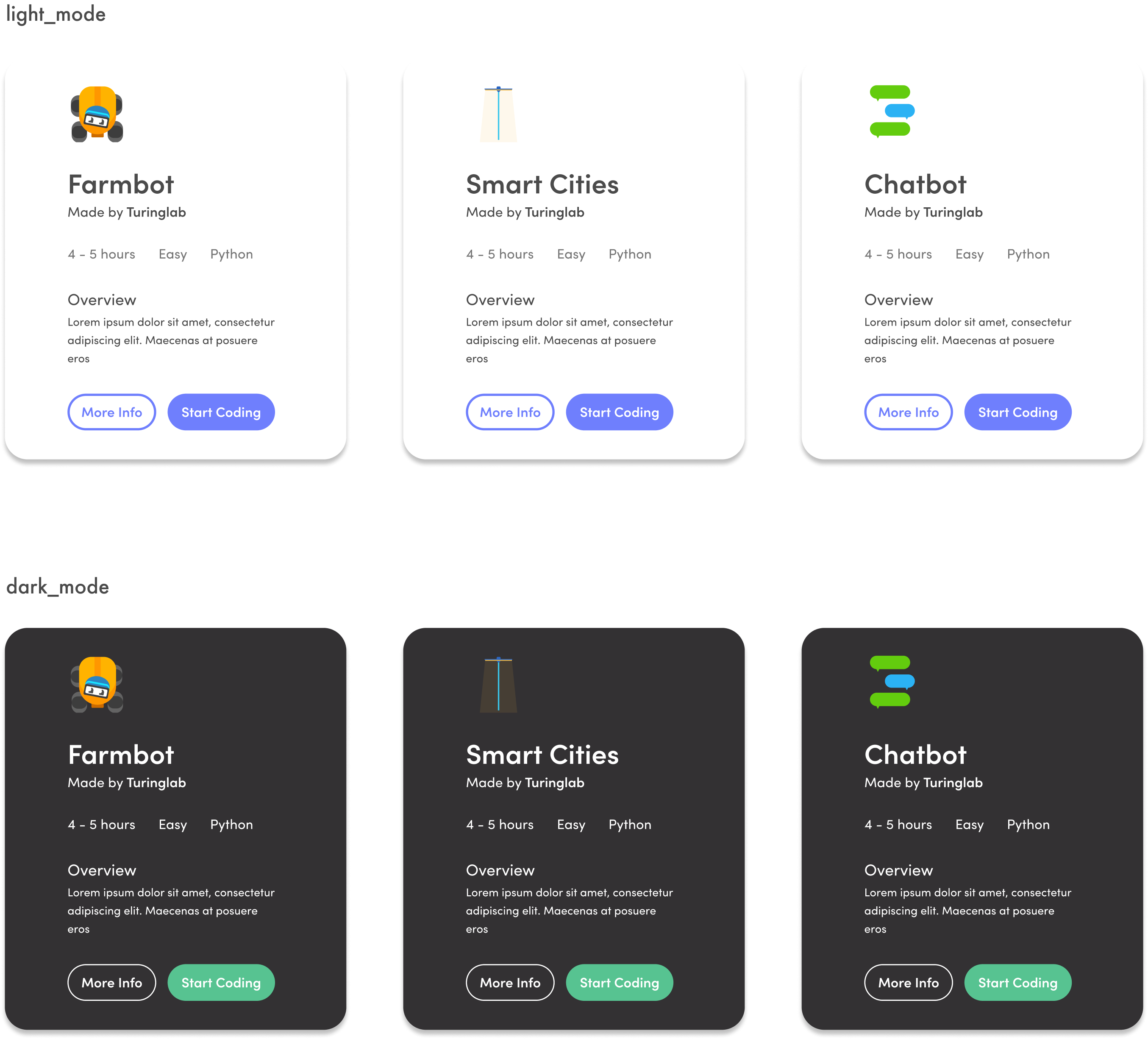
Turinglab has many different clients. Schools, teachers, students, big organisations and non-profits.
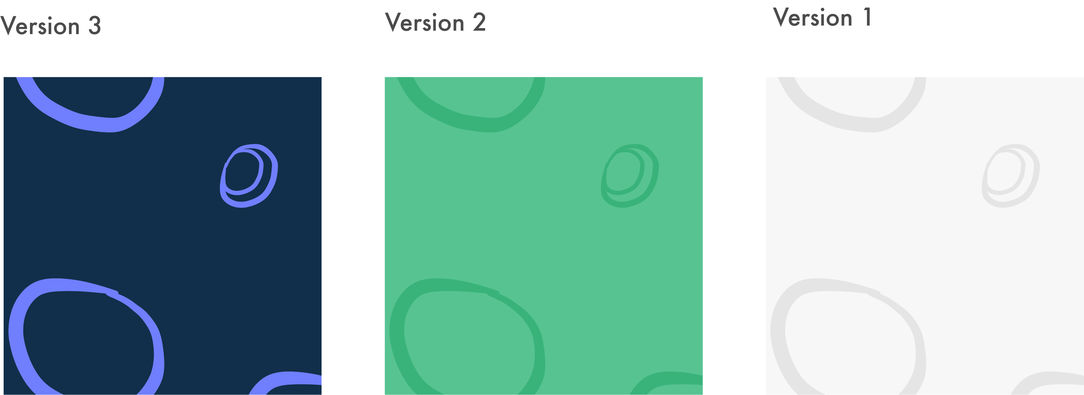
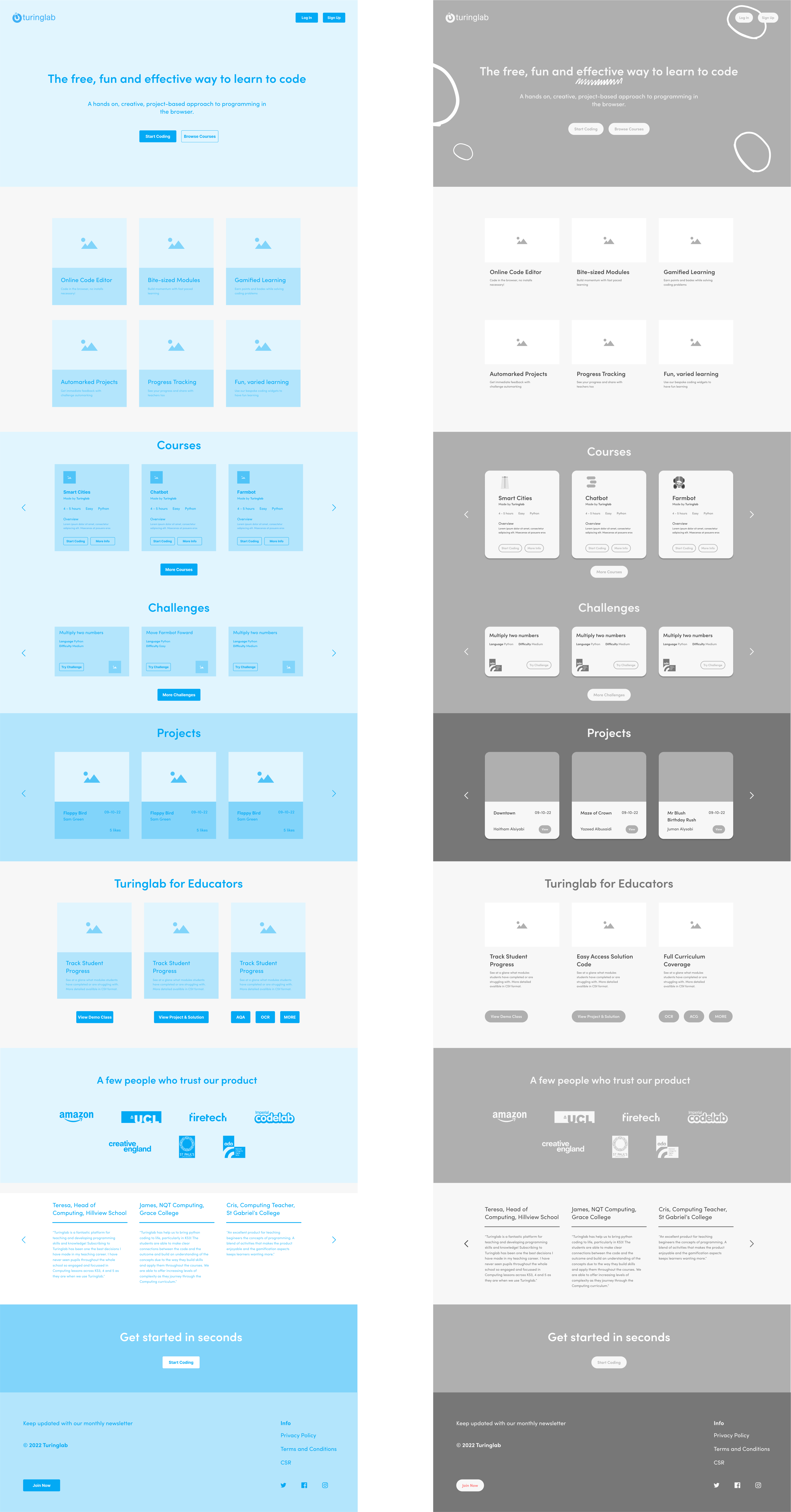
We decided the website would have a 'light' and 'dark' mode. The light mode would appeal to younger users and the dark mode would be more suitable for older students and potential partners.
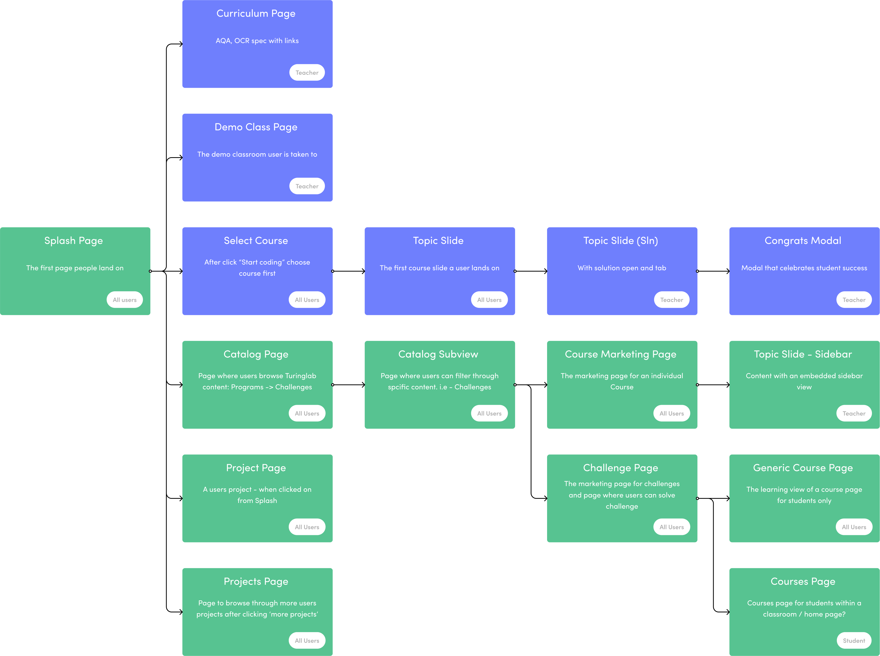
Before creating the UI for the new site we had to have a big think about how our new user flow was going to best fit together
This, of course, required a whole bunch of different wireframes for A-B testing.
A new site meant a new user flow.
Users would now land on the splash page and have quick access to Turinglab's learning materials. We had to think carefully about how all this was going to fit together.
Next Project